Creating a proxy for local instability using geospatial event data
By Jack Gregory in R Competition
March 21, 2023

TL;DR
This blog shows how to use Armed Conflict Location and Event Data (ACLED) event data and geospatial techniques in R to construct location-specific indicators of local instability. Using hypothetical business locations in Ecuador, I demonstrate how nearby adverse events can be aggregated into a simple measure of exposure to insecurity, which can then be used to compare locations or incorporated into analyses of business outcomes.
Introduction
In the Western world, we can sometimes overlook the benefits derived from operating within stable and peaceful communities. As an extreme example, the War in Ukraine is a recent reminder of how quickly civil society can be turned upside down. Prior to the invasion in 2022, businesses in Ukraine confronted many of the same risks and challenges as elsewhere in Europe. Afterwards, these businesses were forced to navigate additional issues precipitated by the conflict.
In this regard, I describe a methodology to proxy for the insecurity and violence experienced by individual businesses using R. I demonstrate how to build location-specific instability indicators using geospatial event data from ACLED. The ACLED Project synthesizes reported social and political events across space and time. These events can be associated with specific businesses—or any address for that matter—and aggregated to proxy for local instability.
The methodology was developed with the International Trade Center (ITC) for their small and medium enterprise (SME) fragility research in the SME Competitiveness Outlook 2023 ( ITC 2023). Originally, business locations were obtained from the ITC Business Fragility Survey: a national business-level questionnaire aimed at assessing how SMEs cope within fragile social and political environments. As the Survey data is proprietary, I base the derived indicators herein on a randomly generated set of locations in Ecuador. Further details on the Survey and the related indicators can be found in the associated project description.
The remainder of this blog is organized as follows. The next two sections describe the necessary data. The first collects and cleans ALCED data for Ecuador and its neighbors, and performs a short exploratory analysis. The second generates a random sample of Ecuadorian businesses. Next, we combine these two datasets to calculate a localised instability indicator and briefly demonstrate the results. Finally, we conclude.
ACLED Data
The ACLED Project is a disaggregated, global and open dataset of reported events ( Raleigh et al. 2010).1 ACLED data are derived from local, regional and national print sources and updated each week. ACLED codes reported events based on three categories and six types, where the taxonomy is summarized in Table 1 below. Additional information about the dataset can be found in the ACLED Codebook and the various User Guides.
|
Event Category |
Event Type |
|---|---|
|
Violent events |
Battles |
|
Explosions/Remote violence |
|
|
Violence against civilians |
|
|
Demonstrations |
Protests |
|
Riots |
|
|
Non-violent actions |
Strategic developments |
The analysis in this blog is based on a subset of ACLED data accessed on 21 February 2023. I queried all events for Ecuador and its neighbors—Columbia and Peru—between 2018 and 2022 inclusive. Despite the objective to develop a proxy for instability for Ecuadorian businesses, I have included Columbia and Peru as it is possible for instability to leak across national boarders.2 I manually downloaded the data using the online ACLED Data Export Tool.3
Cleaning
After some initial wrangling, I import the data into R memory from an rds file. I also use the
dplyr package to sort observations based on their id and convert variable names to uppercase.
df.acled <- readRDS(here::here("acled.rds")) |>
dplyr::arrange(event_id_cnty) |>
dplyr::rename_with(stringr::str_to_upper) |>
dplyr::rename(LAT = LATITUDE, LON = LONGITUDE)
Before proceeding, we also remove any duplicate observations and add an event category field.
df.acled <- df.acled |>
dplyr::distinct() |>
dplyr::mutate(EVENT_CATEGORY = dplyr::case_when(
EVENT_TYPE %in% c("Protests","Riots") ~ "Demonstrations",
EVENT_TYPE=="Strategic developments" ~ "Non-violent actions",
EVENT_TYPE %in% c("Battles","Explosions/Remote violence","Violence against civilians") ~ "Violent events",
TRUE ~ as.character(NA)
)) |>
dplyr::relocate(EVENT_CATEGORY, .before=EVENT_TYPE)
The dataset includes 27,533 observations for Ecuador, Colombia and Peru. Only 11 percent of the observations are associated with Ecuador. This is not unexpected as Ecuador is a much smaller country—in both area and population—compared to its neighbors. Since our objective is to proxy for local instability, we can discard events in Columbia and Peru which occur far from their borders with Ecuador. I, thus, restrict the data to the Ecuadorian mainland including a 50 km buffer.4
To perform a geospatial filtering operation, we require the national and subnational boundaries of Ecuador. I rely on geospatial data from the
Database of Global Administrative Areas (GDAM). After downloading the necessary shapefiles, I use the
sf package and a bespoke function called read_gadm() to import the data.
Code 💻
sf.ecu <- read_gadm(here::here("gadm41_ECU_shp.zip"), level="subnational")
Map 🗺️
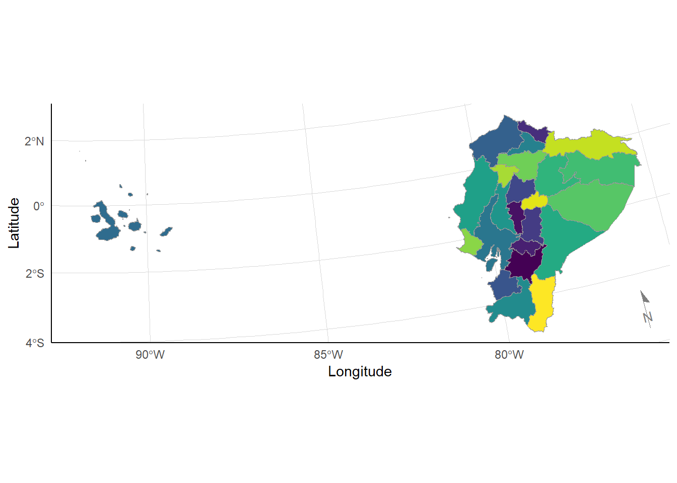
Figure 1: Subnational boundaries for Ecuador
From the map, the Galápagos Islands appear to the west of Ecuador in the Pacific. Since I only want to collect events on the mainland, I use the dplyr package to remove the Islands and any unnecessary columns.
Code 💻
sf.ecu <- sf.ecu |>
dplyr::select(GID_0, COUNTRY, NAME_1) |>
dplyr::filter(NAME_1!="Galápagos")
Map 🗺️
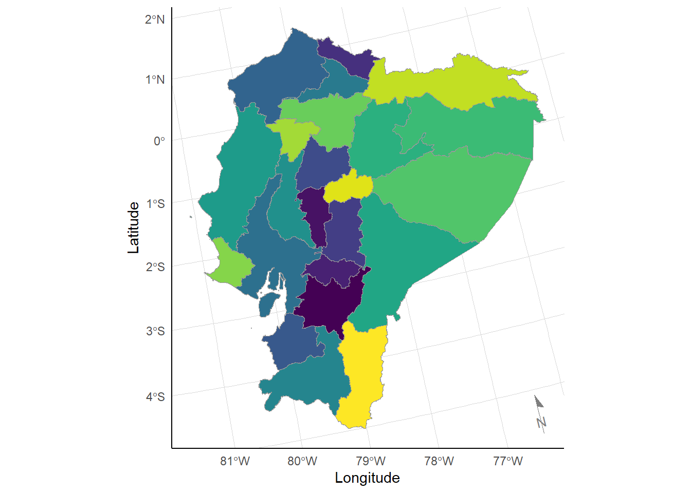
Figure 2: Subnational boundaries for Ecuador mainland
With just the mainland, I can now join all the subnational units and create a buffer of 50 km around the Ecuadorian mainland, using the sf::st_union() and sf::st_buffer functions respectively.
Code 💻
sf.ecu_buffer <- sf.ecu |>
sf::st_union() |>
sf::st_buffer(dist=units::set_units(50, km))
Map 🗺️
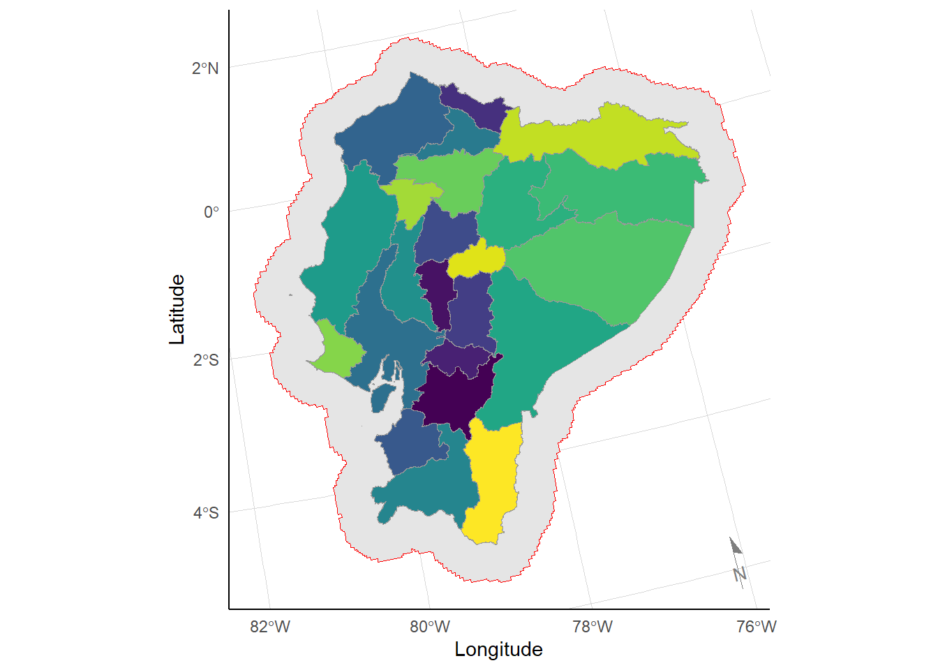
Figure 3: Subnational boundaries for Ecuadorian mainland and buffer area
It is now possible to filter the ACLED data on coordinates using the Ecuadorian buffer area generated above. I first convert the ACLED latitude and longitude coordinates into geospatial data.5 I then filter the data using the sf::st_contains() function. This returns a list of integers defining those events within the Ecuadorian buffer area. I reapply this list to to the df.acled dataset.
Code 💻
l.sample <- df.acled |>
sf::st_as_sf(coords=c("LON","LAT"), crs=4326) %>%
sf::st_contains(x=sf.ecu_buffer, y=.)
df.acled <- df.acled[unlist(l.sample),]
Map 🗺️
The map above summarizes the location and year of all events remaining in the sample. The dataset now includes only 4,049 events, where 74 percent are located within Ecuador.
Exploratory Analysis
This section performs some exploratory analyses on the ACLED data sample within the Ecuadorian buffer area. I investigate temporal variation and event categorization.
Temporal variation
I first investigate the variation in events across time. I aggregate events by month and prepare an event timeseries plot.
Code 💻
df.acled_mth <- df.acled |>
dplyr::mutate(EVENT_DATE = lubridate::dmy(EVENT_DATE),
EVENT_MONTH = lubridate::floor_date(EVENT_DATE, unit="month")) |>
dplyr::group_by(EVENT_MONTH) |>
dplyr::summarise(N = dplyr::n(), .groups="drop")
Plot 📈
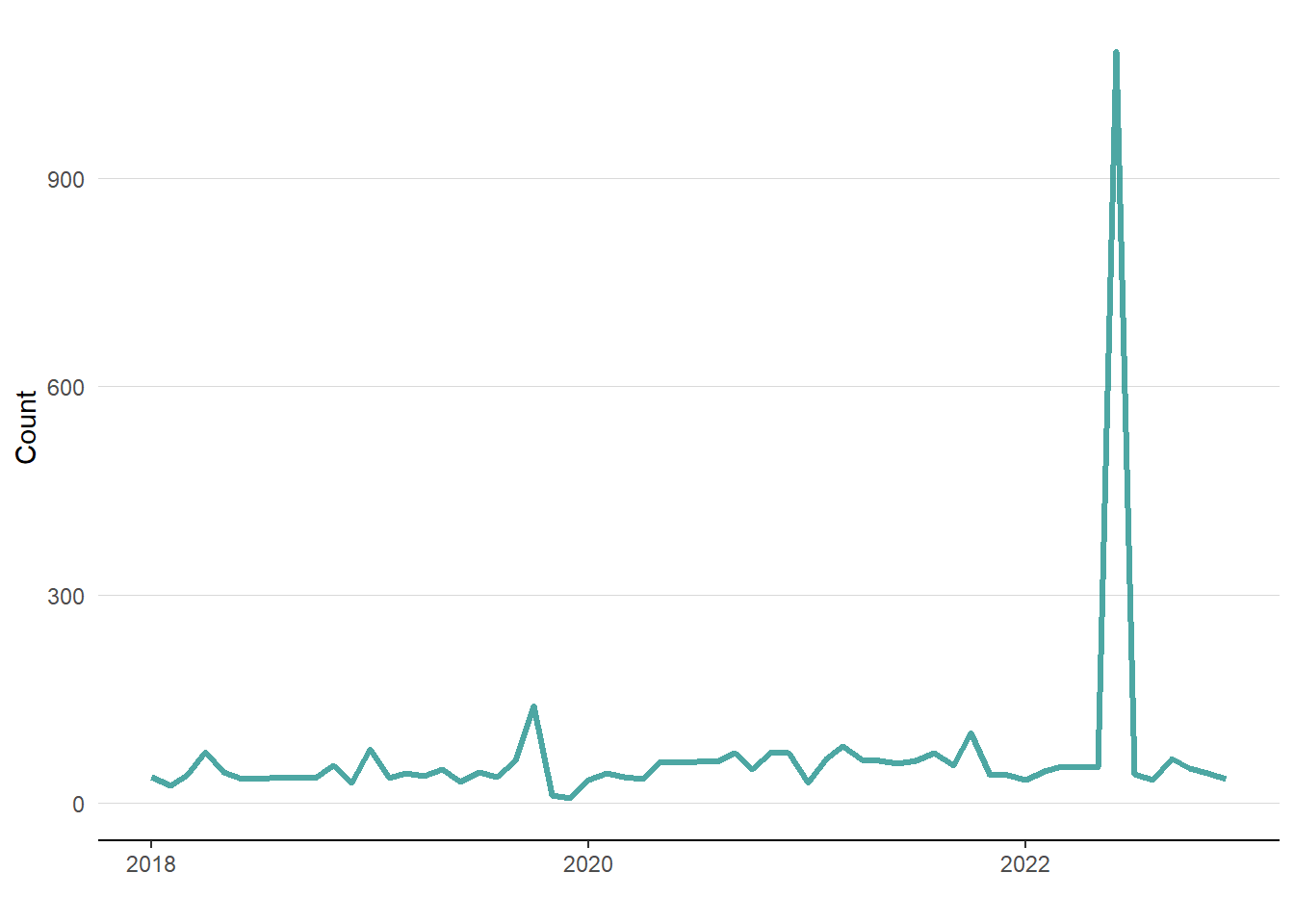
Figure 4: Event timeseries by month for Ecuadorian buffer area
From the timeseries plot above, events in the Ecuadorian buffer area appear to be relatively stable over the five-year sample period. Though, there are a couple notable months including:
- October 2019 when events exceeded 100; and,
- June 2022 when events exceeded 1,100.
To ensure the sensibility of the data at the national level, I confirm that these deviations are consistent with the historical record. In October 2019, Ecuador experienced a series of protests against austerity measures including the cancellation of fuel subsidies. In June 2022, Ecuador again suffered a series of protest against the increased cost of living including higher fuel and food prices.
Event categorization
Next, I investigate variation in event category, including: demonstrations, non-violent actions, and violent events.6 I first produce a frequency table. Between 2018 and 2022, demonstrations are more common than the other two categories combined. They make around three quarters of all events in Ecuador over this time period.7
|
Category |
Observations |
Share |
|---|---|---|
|
Demonstrations |
3,086 |
76% |
|
Non-violent actions |
120 |
3% |
|
Violent events |
843 |
21% |
I now prepare a timeseries plot by month and event category. Unsurprisingly, demonstrations consist of the vast majority of events within the Ecuadorian buffer area. Moreover, the spikes in October 2019 and June 2022 are almost exclusively due to demonstrations. This is also unsurprising given the nature of the events and the increased protests and riots during these months.
Code 💻
df.acled_mth_cat <- df.acled |>
dplyr::mutate(EVENT_DATE = lubridate::dmy(EVENT_DATE),
EVENT_MONTH = lubridate::floor_date(EVENT_DATE, unit="month")) |>
dplyr::group_by(EVENT_CATEGORY, EVENT_MONTH) |>
dplyr::summarise(N = dplyr::n(), .groups="drop")
Plot 📈
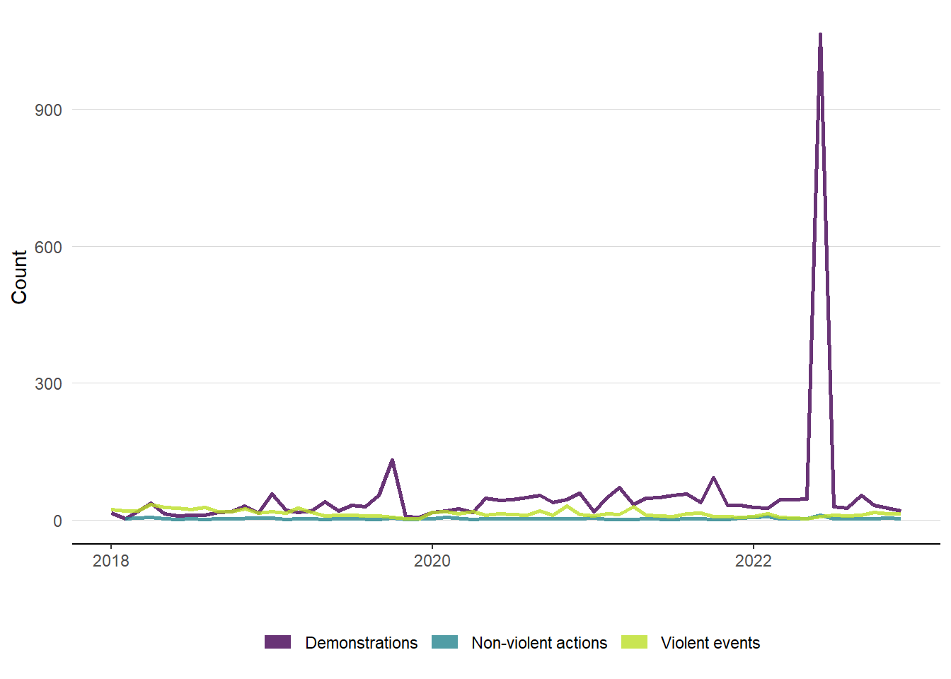
Figure 5: Event timeseries by month and category for Ecuadorian buffer area
Businesses
With the ACLED event sample cleaned, I now prepare a randomly generated set of locations in Ecuador upon which to build the instability indices. This can easily be done using the geospatial data for Ecuador and the sf::st_sample() function. I’ll create a sample of 50 “businesses” randomly located within Ecuador. The sampled points won’t necessarily be near population centers, but they should suffice for illustrative purposes.
Code 💻
set.seed(1010)
sf.ecu_pts <- sf.ecu |>
sf::st_union() |>
sf::st_sample(size=50, type="random") |>
sf::st_as_sf(crs=4326) |>
tibble::rowid_to_column(var="BUSINESS_ID") |>
dplyr::rename(geometry = x)
Map 🗺️
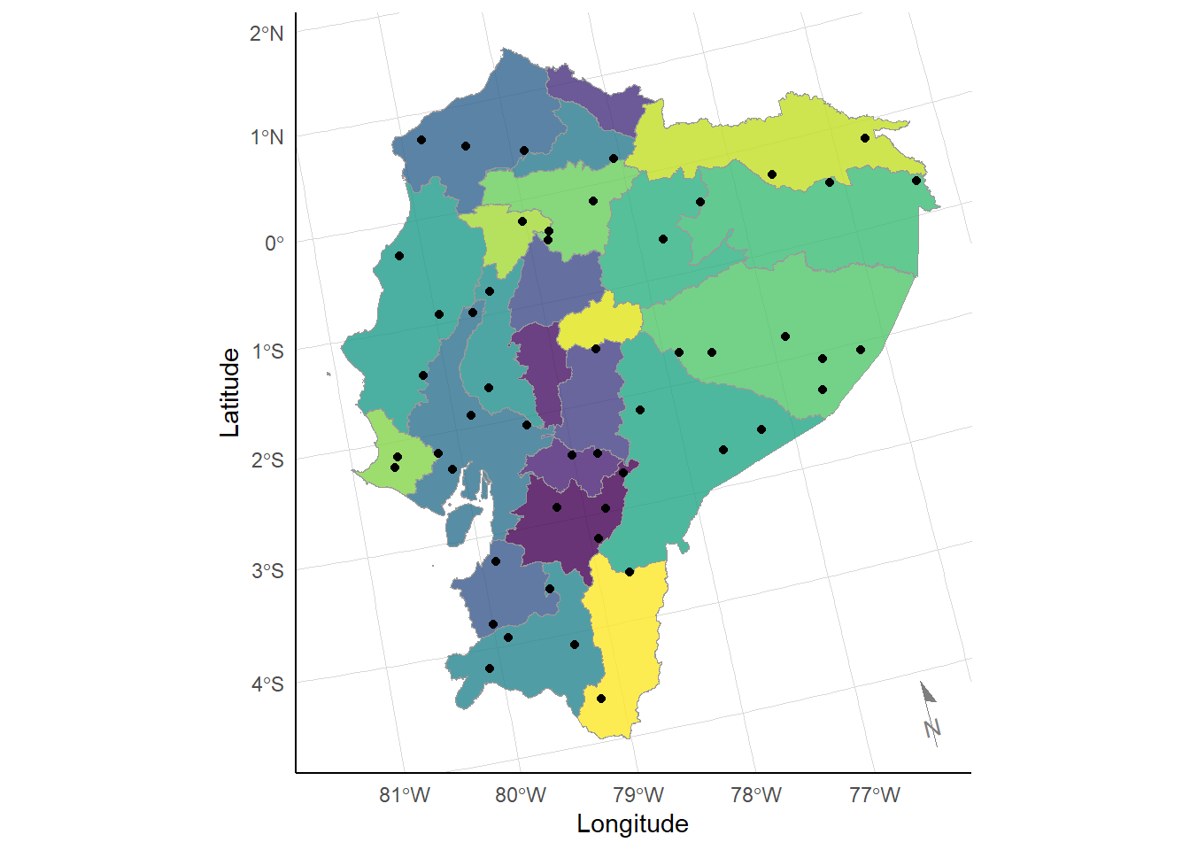
Figure 6: Sample business points
Indicator
Calculation
Each event in the ACLED dataset is geocoded. Hence, each “business” in the random sample can be associated with nearby events. These can be aggregated to proxy for local instability at the business-level, through an “event frequency” indicator. We define the indicator as the count the number of ACLED events for a particular event type and year at a given radius from the sample business coordinates. We weight all events equally across distance, time and category.8
We use the sf::st_buffer() function to establish an area around each sample business. We utilise a radius of 50 km, which is defined in meters.
Code 💻
sf.ecu_areas <- sf::st_buffer(x=sf.ecu_pts, dist=50*10^3)
Map 🗺️
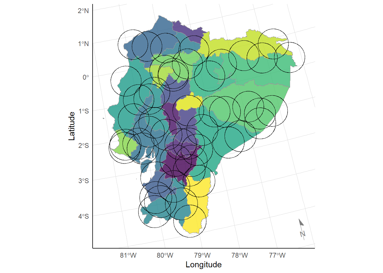
Figure 7: Sample business areas
Next, we convert the ACLED data into “simple features” dataframe, but we keep the geographic data as points.
sf.acled <- sf::st_as_sf(df.acled, coords = c("LON","LAT"), crs=4326)
We then compare the sample business areas with the ACLED event points both in-country and its neighbouring countries. Moreover, we do so in a disaggregated fashion based on the EVENT_TYPE and YEAR fields. Since EVENT_TYPE is subsumed with the EVENT_CATEGORY field, we can disaggregate on the former and retrieve results for both categorizations.
We first extract lists of distinct EVENT_TYPE categories and YEARs.
l.type <- df.acled |>
dplyr::distinct(EVENT_TYPE) |>
dplyr::arrange(EVENT_TYPE) |>
dplyr::pull() |>
as.list() |>
purrr::set_names(nm=c("Battle","ERV","Protest","Riot","SD","VAC"))
l.yr <- df.acled |>
dplyr::distinct(YEAR) |>
dplyr::pull() |>
as.list()
Now, we can run the comparisons by performing a nested iteration over event types and years.
## Define empty list
l.ind <- list()
## Perform comparisons
for (type in l.type) {
for (yr in l.yr) {
## Restrict ACLED point sample by event type, countries and year
sf.acled_temp <- sf.acled |>
dplyr::filter(EVENT_TYPE==type) |>
dplyr::filter(YEAR==yr)
## Compare ITC areas to ACLED points
l.ind[[type]][[as.character(yr)]] <-
sf.ecu_areas |>
sf::st_contains(sf.acled_temp, sparse=TRUE)
}
}
What results is a nested list, where the first level defines the event type, the second level defines the year, and the third level defines the BUSINESS_ID. Each element then contains a vector of the ACLED events which fall within the sample business areas.
We can convert the list into a dataframe, where the ACLED variable represent the frequency of the associated events.
## Remove df.ind, if necessary
rm(df.ind)
## Run indicator calculations
for (type in l.type) {
for (yr in l.yr) {
df <- l.ind[[type]][[as.character(yr)]] |>
purrr::imap_dfr(
~{## Use full ACLED dataset
df.acled |>
## Filter on countries and event types
dplyr::filter(EVENT_TYPE==type) |>
dplyr::filter(YEAR==yr) |>
## Add an ID matching l.ind
tibble::rowid_to_column(var="ID") |>
## Filter on matching ACLED IDs
dplyr::filter(ID %in% .x) |>
## Summarise events and fatalities
dplyr::summarise(ACLED = dplyr::n(),
FATAL = sum(FATALITIES, na.rm=TRUE)) |>
## Add BUSINESS_ID and EVENT_TYPE
dplyr::mutate(BUSINESS_ID = .y,
EVENT_TYPE = type,
YEAR = yr)
})
if (!exists("df.ind")) {
df.ind <- df
} else {
df.ind <- rbind(df.ind, df)
}
}
}
Finally, we revise the dataframe by adding event categorization and labels.
Code 💻
df.ind <- df.ind |>
## Add event categorization
dplyr::mutate(
EVENT_TYPE_LABEL = dplyr::case_when(
EVENT_TYPE=="Explosions/Remote violence" ~ "ERV",
EVENT_TYPE=="Violence against civilians" ~ "VAC",
EVENT_TYPE=="Strategic developments" ~ "SD",
TRUE ~ toupper(stringr::str_replace(EVENT_TYPE, "s$", ""))),
EVENT_CATEGORY = dplyr::case_when(
EVENT_TYPE_LABEL %in% c("BATTLE","ERV","VAC") ~ "Violent events",
EVENT_TYPE_LABEL %in% c("PROTEST","RIOT") ~ "Demonstrations",
TRUE ~ "Non-violent actions"),
EVENT_CATEGORY_LABEL = dplyr::case_when(
EVENT_CATEGORY=="Violent events" ~ "VE",
EVENT_CATEGORY=="Demonstrations" ~ "DEM",
TRUE ~ "NVA")) |>
## Finalize dataframe
dplyr::select(BUSINESS_ID, EVENT_CATEGORY, EVENT_CATEGORY_LABEL, EVENT_TYPE,
EVENT_TYPE_LABEL, YEAR, ACLED)
Table 📅
|
BUSINESS_ID |
EVENT_CATEGORY |
EVENT_TYPE |
YEAR |
ACLED |
|---|---|---|---|---|
|
1 |
Violent events |
Battles |
2022 |
0 |
|
2 |
Violent events |
Battles |
2022 |
0 |
|
3 |
Violent events |
Battles |
2022 |
1 |
|
4 |
Violent events |
Battles |
2022 |
0 |
|
5 |
Violent events |
Battles |
2022 |
0 |
|
6 |
Violent events |
Battles |
2022 |
0 |
Analysis
This section primarily summarizes the merged sample business and ACLED geospatial data. First, we produce a plot with all ITC business from the eight surveyed countries. We utilize a combined ACLED “instability” metric based on the summation of all ACLED-prefixed variables. The map displays the level of instability for each sample business, where lighter colours represent greater instability.
The most-insecure businesses appear to operate near the capital Quito, which is reassuring given the location of protest events during our sample period. All other businesses appear to have relatively low insecurity, though the is some minor variation between them.
Code 💻
df.ind_final <- df.ind |>
dplyr::group_by(BUSINESS_ID) |>
dplyr::summarise(ACLED = sum(ACLED), .groups="drop") |>
dplyr::left_join(sf.ecu_pts, by="BUSINESS_ID")
Map 🗺️
We now plot a histogram of the ACLED indicator, which includes all ACLED events. The distribution confirms our observations above, where most businesses are low insecurity with index values below 100.
Code 💻
df.ind_plot <- df.ind_final |>
dplyr::group_by(BUSINESS_ID) |>
dplyr::summarise(ACLED = sum(ACLED), .groups="drop")
Plot 📈
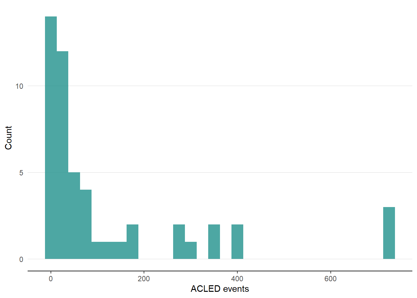
Figure 8: Instability indicator histogram
Conclusion
Based on ACLED data, we developed a local instability indicator that measures the total number of adverse events occurring within a 50 km radius of hypothetical Ecuadorian businesses. While the methodology presented here is intentionally simple, the indicator could be extended in several ways, including by applying distance- or time-based weights, differentiating between event types, or incorporating event fatalities. The resulting indicator can be used as a standalone measure of local insecurity or incorporated as an explanatory variable in broader analyses of local business outcomes.
References
ITC. 2023. SME Competitiveness Outlook 2023: Small Businesses in Fragility: From Survival to Growth. International Trade Centre. https://www.intracen.org/resources/publications/sme-competitiveness-outlook-2023-small-businesses-in-fragility-from-survival.
Raleigh, C, A Linke, H Hegre, and J Karlsen. 2010. “Introducing ACLED: An Armed Conflict Location and Event Dataset: Special Data Feature.” Journal of Peace Research 47 (5): 651–60. https://doi.org/10.1177/0022343310378914.
-
ACLED also includes fatalities associated with events, which could also be utilised in the creation of an index. ↩︎
-
For this analysis, I assume that an event in Colombia or Peru will affect an Ecuadorian business in a similar manner to a domestic one. I abstract away from the potential biases across countries in reporting as well as in ACLED event collection practices. ↩︎
-
Alternatively, it is possible to access the data using the
acled.apipackage in R. However, the necessary permissions must first be requested from ACLED in order to access their API. It should also be noted that despite the data being publicly available, ACLED imposes annual download limits per account. ↩︎ -
The buffer distance defined here is relatively arbitrary. However, it is informed by the fragility literature which finds that events can have local impacts around 100 km from their source. This latter distance was utilized in the ITC fragility research described in the Introduction. ↩︎
-
As a general note, ACLED uses latitude and longitude coordinates based on the EPSG:4326 projection. ↩︎
-
The ACLED project is also disaggregated by event type and sub-event type. Please see the ACLED Codebook for further information. ↩︎
-
The exceptionally low number of non-violent actions could be explained by journalistic bias and the associated under-reporting of less sensational events. It also could be due to ACLED collecting only a subset of all non-violent actions. ↩︎
-
These definitions abstract from the timeliness of events; moreover, they treat relevant events as binary–that is, either they are within our arbitrary geographic cutoff or not. However, the disaggregated nature of the ACLED data could facilitate the development of more elaborate weighted indicators prior to modelling. More sophisticated versions could define the effective region surrounding a business by using a weighted average based on the square distance between the businesses and events. We could weight more recent events higher or assess each business based on the ACLED events in the five years leading up to the period of evaluation. ↩︎